TTAB Finds Two "MAGIC CITY" Logos Confusable for Overlapping Clothing Items
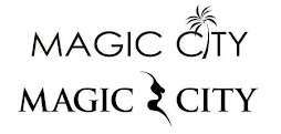
The Board affirmed another Section 2(d) refusal, finding the mark shown first below, for "clothing, namely, shirts, hats, sweatshirts, shorts and sweatpants," likely to cause confusion with the registered mark shown second below, for "shorts; sports caps and hats; sweat shirts; t-shirts." The goods overlap, so the Board must presume that those goods travel in the same trade channels to the same classes of consumers, who are not necessarily sophisticated purchasers. What about the marks? In re West Flagler Associates, Ltd., Serial No. 87921527 (December 16, 2022) [not precedential] (Opinion by Judge Robert H. Coggins).
In its reply brief, applicant proposed an amendment to its identification of goods to add the words "all in connection with a casino, jai alai stadium, and live concert venue in Miami, Florida." The Board observed that the request was untimely, and in any case would not avoid a likelihood of confusion.
The Board found the marks to be similar in appearance because the largest portions thereof are the words "MAGIC CITY." The Board also found that the design elements of the mark "are not nearly as significant as the marks' literal elements."
Applicant argued that the marks have different connotations: that its “palm tree design communicates a tropical place, which is suggestive of the commercial context in which Applicant[] uses its mark . . . in Miami, Florida,” while “Registrant’s [m]ark includes the design of a silhouette of a naked woman, which is suggestive of its . . . strip club in Atlanta, Georgia." [I must be getting old because I didn't see that in registered mark. - ed.]. The Board was unmoved.
We agree that the palm and silhouette elements of the marks differ, but that difference does not outweigh the larger and dominating literal MAGIC CITY element of the respective marks. As a result, and particularly because of the dominant MAGIC CITY element of each mark, the marks convey essentially identical meanings and create similar commercial impressions.
Applicant pointed out that the marks have co-existed since 2009 without actual confusion. The Board, however, noted the lack of evidence of the extent of use of the cited mark. Moreover, since applicant is in Miami and registrant in Atlanta, there would be no geographic overlap and almost no opportunity for actual confusion to occur. Also, the registrant has no chance to submit evidence in this proceeding, the applicant's assertion of no actual confusion is entitle to little weight.
Under the 13th DuPont factor, Applicant pointed to its ownership of six registrations for MAGIC CITY marks, invoking the Strategic Partners precedent. The Board, however, observed that the prior registered marks were not the same as the proposed mark; in fact, the proposed mark is closer to the cited mark than the prior marks.
Read comments and post your comment here.
TTABlogger comment: I actually thought the design element in the cited mark looked like a brassiere, so maybe I'm not that old.
Text Copyright John L. Welch 2022.


2 Comments:
I thought that design element looked like the front half of a gazelle!
[Under the 13th DuPont factor, Applicant pointed to its ownership of six registrations for MAGIC CITY marks, invoking the Strategic Partners precedent. The Board, however, observed that the prior registered marks were not the same as the proposed mark; in fact, the proposed mark is closer to the cited mark than the prior marks.]
Huh? This made me go look because I was with the Board up until this point. The applicant has registrations for the exact logo, and MAGIC CITY in standard characters. They are for different G&S though.
Post a Comment
<< Home