Boston Red Sox Oppose Stylized "SA" Mark for Clothing
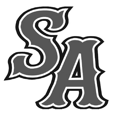
Yesterday's post featured the New York Yankees, so let's give the Boston Red Sox equal time, shall we? The Red Sox have opposed registration of the mark shown below, for clothing, claiming likelihood of confusion, false association, and failure to use the mark on all the goods. Now what marks do you think the Red Sox rely on? Boston Red Sox Baseball Club Limited Partnership v. Visual Impact Products, LLC, Opposition No. 91189914.

According to the notice of opposition, the Red Sox "have used marks that consist of or incorporate the letters S and/or B and the words RED SOX and/or BOSTON, alone or with other word and/or design elements, in a particular, distinctive, stylization associated with the Club":


In short, the Red Sox contend that the letters in the stylized SA mark look too much like the letters S and B in the RED SOX marks! Seems like BS to me. What do you think?
Text Copyright John L. Welch 2009.


4 Comments:
The Red Sox have no more right to exclusivity on the letter "S" plus any second letter than does Major League Baseball have the right to stop others from protecting any visualization of a baseball player swinging a bat toward a ball. This is such a ridiculous opposition that I wonder whether the applicant could succeed in a Motion to Dismiss alleging lack of standing!
Isn't the stylization of the lettering used uniquely by the Red Sox? Or at least a Google search shows that a lot of people call it the "Red Sox font." Could be a trademark in my book.
Go Sox.
Anyone heard of Rule 11? This should not survive a motion for judgment on the pleadings. But, sadly, the little guy probably will be rolled.
I agree the font looks like the same font, but can we really give them a monopoly on any combination of letters in that font? That would seem to go way beyond their trademark rights. Most importantly, though the font is similar it's not so similar that I think "Red Sox" when the letters are SA. RSB, SX, RS, RX or RSA even, but not SA - what could that possibly mean?
Post a Comment
<< Home