TTAB Finds Arrowhead Design Marks Confusingly Similar
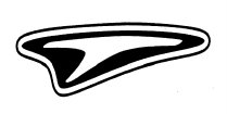
The Board affirmed a Section 2(d) refusal to register the design mark shown immediately below for motorcycle clothing (including gloves and boots), finding it likely to cause confusion with the two registered marks shown further below, for motorcycle helmets, boots, spectacles, and protective clothing and gear. In re Specialty Sports Ltd., Serial No. 76391643 (October 20, 2005) [not citable].
The Board found the goods to be identical in part and otherwise closely related. It also presumed, as required, that the goods of the parties are marketed in the same (normal) trade channels to the same classes of purchasers. And it observed that the goods "would not necessarily be purchased with a great deal of care. Applicant did not contend otherwise.
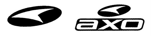
Instead, Applicant asserted that the marks are so dissimilar that confusion is not likely: its mark is a "forward-looking 'T,' which 'is presented against the background of and within an emblem which itself has the appearance of a forward-looking 'T,' and which includes a distinguishing white band around its perimeter." On the other hand, the cited design-only mark "is a reverse arrowhead-like design presented against a solid, oval-shaped background."
That argument missed the target. The Board pointed out that the fact that the designs are not identical is not dispositive. Rather than a side-by-side comparison, "the focus is on the recollection of the average purchaser, who normally retains a general rather than a specific recollection of trademarks."
Here, the Board observed, "purchasers are likely to remember, generally, the appearances and commercial impressions of the marks as being arrowhead-like designs on dark backgrounds. They are not likely to remember any detailed differences between the marks which are apparent only upon a side-by-side comparison of the marks."
Applicant's contention that its mark is a stylized "T" was "especially unpersuasive." The Board noted that the letter "T" is not part of Applicant's trade name and does not appear to have any connection with its business or goods. Moreover, the alleged "T" is so highly stylized that it is "extremely unlikely" that purchasers will perceive it as a "T."
Finally, the Board noted that, when the goods involved are identical or closely related, the degree of similarity between marks necessary to support a likelihood of confusion finding is lessened.
Turning to the cited design-plus-word mark, the Board found it "similar" to the applied-for mark. The presence of the stylized letters AXO is "insufficient to render the marks dissimilar when the marks are viewed in their entireties." Moreover, "[t]he design feature appears first in the registered mark, on top of the letters, and its contribution to the overall commercial impression of the mark is undeniable."
The Board stated, in closing, that if any doubts exist regarding affirmance of this Section 2(d) refusal, those doubts must be resolved against Applicant.
Text Copyright John L. Welch 2005.
posted by John L. Welch @ 11/02/2005
0 comments
![]()
![]()


0 Comments:
Post a Comment
<< Home